We have finally arrived at the final portion of the CFSG and it’s time to talk about the SEC. The conference boasts a lot of good looks and I’m sure there will be a lot of dispute over these rankings. I want to remind everyone that these are subjective and are based upon the same scale that I’ve been using.
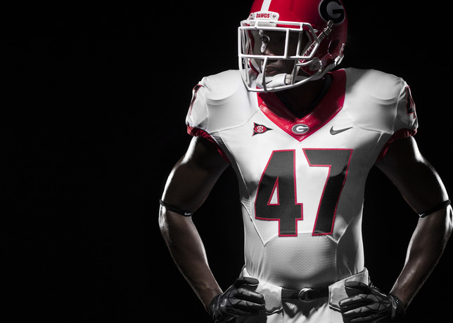
1. Georgia Bulldogs: 92 (NIKE)
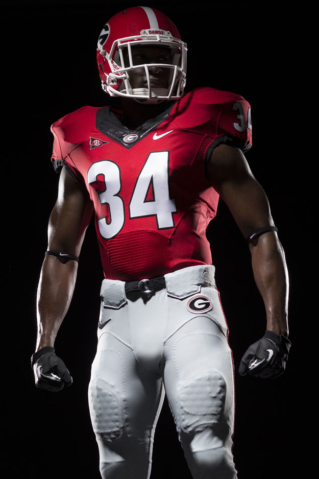
The Bulldogs have a classic uniform that has not changed too much over the years. The team did change the number font and added a contrast collar. The contrast collar looks much better on the road jerseys than the home. I like the helmets and Georgia doesn’t rock the boat much in terms of different helmet finishes. There were a few years in the mid-2000’s that Georgia explored a variety of bizarre Nike options. The reason the grade isn’t quite as high as it could be is due to the refusal to add the black jersey back into the rotation. The Bulldogs lost in the black (once, maybe twice?) and have not worn it since. I hate to break it to you, but you don’t lose because of the jerseys you are wearing. Bring back the black jerseys and the grade will be higher next year. The “silver britches” are a unique facet.
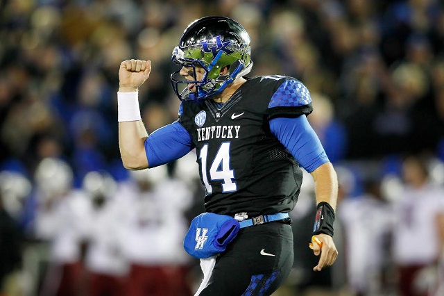
2. Kentucky Wildcats: 89 (NIKE)
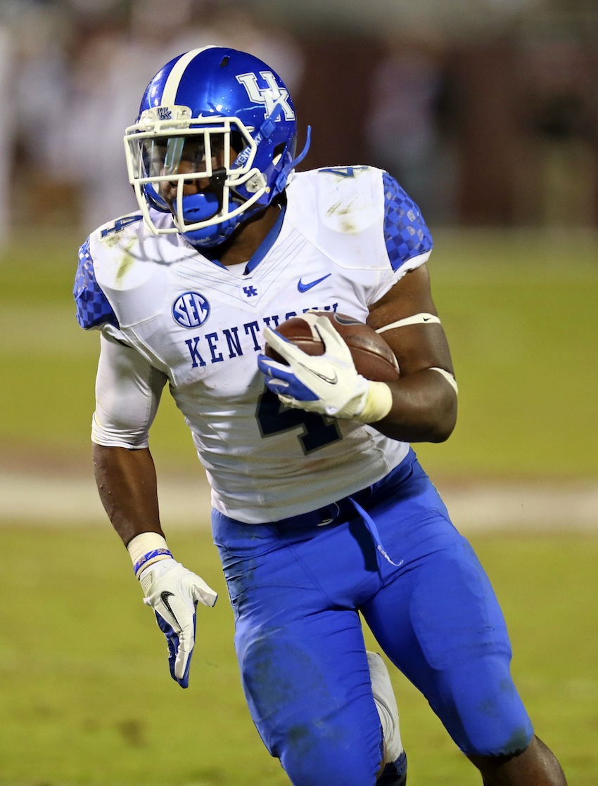
The Wildcats have a lot of different options and it can (occasionally) be difficult to judge a set of uniforms that are this vast. I think the helmet design is quite nice and the logo fits nicely. The helmet options are numerous and I think the best two are probably the blue chrome and the (more traditional) white. I love the checkered pattern on the shoulders and the Wildcats keep their looks consistent. The black uniform isn’t bad at all and (Nike loves grey) the grey isn’t terrible. The Wildcats have done a lot to make their look noteworthy in an effort to bolster recruiting efforts. The uniform the Wildcats used against South Carolina was one of the top looks in the country last season according to several uniform critics.
3. Missouri Tigers: 79 (NIKE)
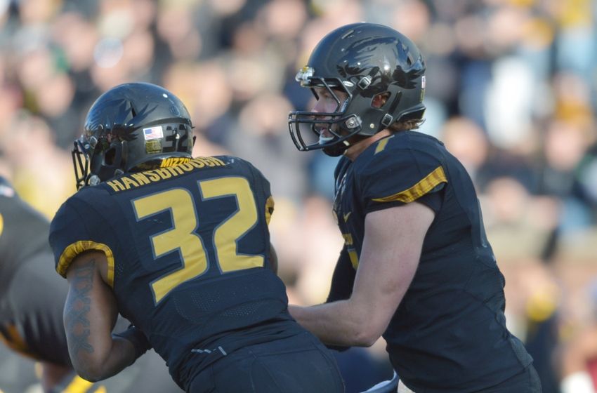
A polarizing look that can get really busy on the road. The Mizzou all-black is one of the best in the country and I love those alternate helmets. The silver overlay is amazing and I also enjoyed the high-sheen black over the (matte) black helmet last year. The pants are a not as good as they used to be when they were actually gold and not a dark yellow. I still think Mizzou has a strong set of uniforms despite the tweaks. The traditional helmet is probably their biggest vice, so why not just eliminate them? The Tigers have a phenomenal set of alternate helmets.
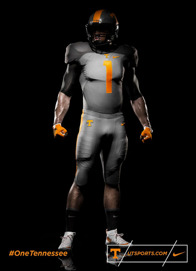
4. Tennessee Volunteers: 76 (NIKE)
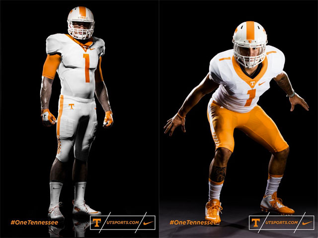
The Volunteers have a loud, primary color. The rest of the uniform is designed to mute that color. I think the Nike redesign has been good and I like the checkerboard pant trim. The black and grey jersey combo is a little odd to me. I don’t really know how it will look until it’s on television. I think there is a chance the lighter grey on the body could look odd when players sweat and the dark shoulder design is a little unnecessary. The dark helmet is cool though. The traditional look is the best and the Vols typically look best on the road when they wear white tops and orange pants.
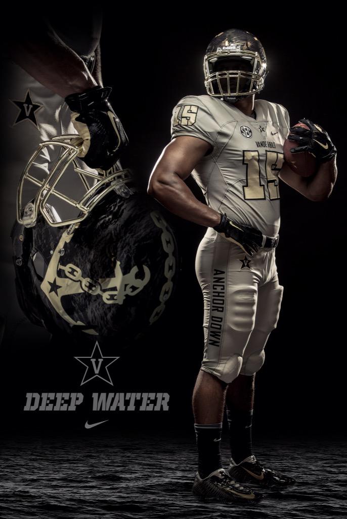
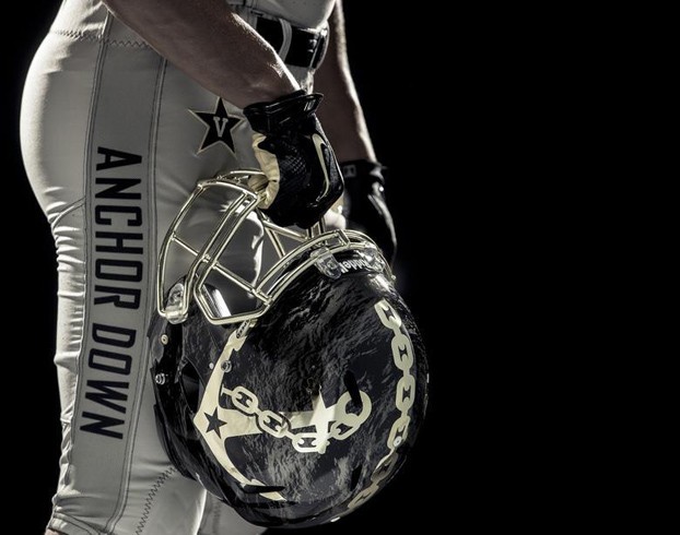
5. Vanderbilt Commodores: 72 (NIKE)
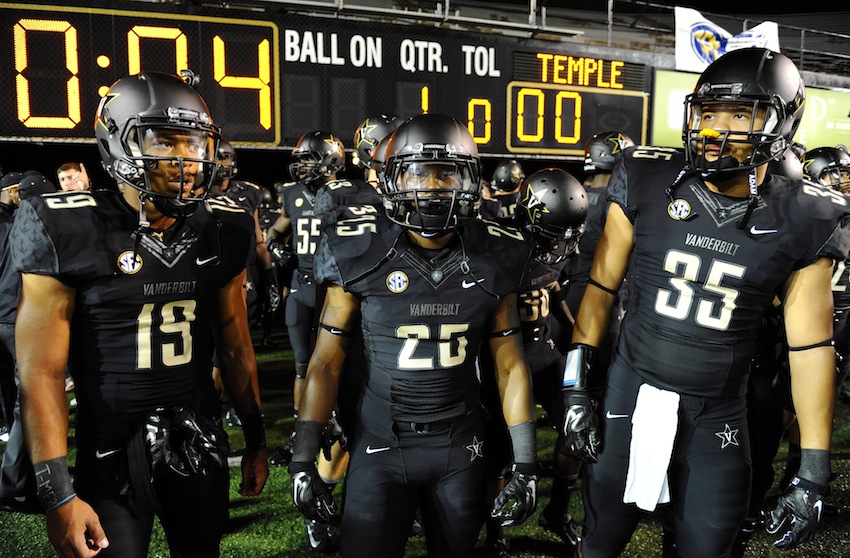
The Commodores uniform flies (maybe sails?) out of the minds of most fans. The helmet design is actually nice and I like these alternate options they have debuted. The Vanderbilt gold color is a quirky shade and I would probably prefer those to be phased out. I like the black helmets a lot and the “Anchor Down” on the pants of their newest alternate is pretty cool. The team would get more uniform love if they were more successful.
6. Florida Gators: 67 (NIKE)
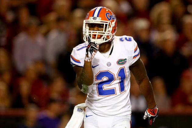
The Gators are a bit of a tough team to score. I like the helmets and the colors are good. I would almost say the colors are unique in that they are both quite vibrant. The problems arise in the tweaks that have occurred over the last few years. I don’t like the new number font and the logo that used to be stitched in is now stamped on. The rubber logo stamp makes these jerseys look a little cheap. Florida has had a lot of problem in making it’s all-blue look work. The issue has been that the jerseys (worn more often and washed more often) look dull compared to the pants (a little shiny and obviously not faded from the wash). I think the “F” logo could be put on the helmet and loved the alternate helmets worn against Florida State during Tebow’s senior year. I think the orange jersey is pretty cool and the combinations are fairly vast. Muschamp tended to prefer the traditional home and all-white road options, so we’ll see what their new staff chooses.
7. South Carolina: 58 (Under Armour)
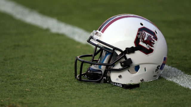
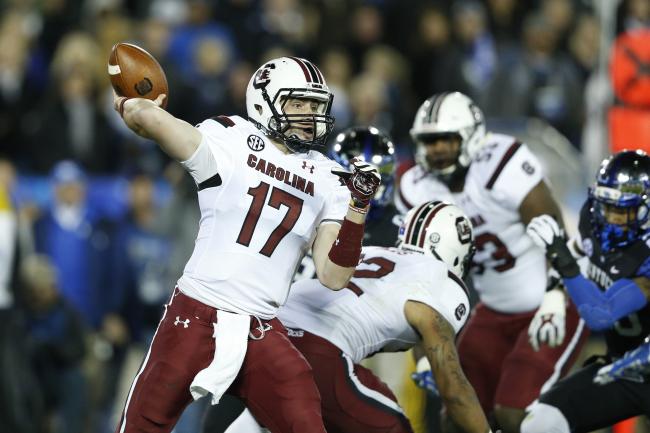
The Gamecocks have the worst helmet in the conference. They have two primary colors and they can’t seem to get the uniforms quite right. I know there is mention of an all-black look being used more often in 2015. I still think the use of this look in combination with a white helmet won’t look that great. I can’t understand why they feel the need to constantly tweak stripes when they need to fix the helmet. The interlocking “SC” logo that the baseball team uses might be something to explore. The block “C” is not clunky. I think their best look is their all-white and I don’t really think highly of those. The stripe under the arm is odd.
