The suspense has to be killing all of you. We have finally arrived in the division inhabited by the Oregon Ducks. Oregon is Nike, Nike is Oregon. A company built a college football powerhouse. There are other teams in this division, but I will give the people what they want.
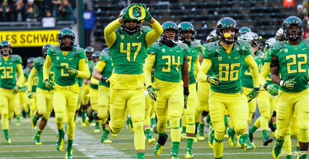
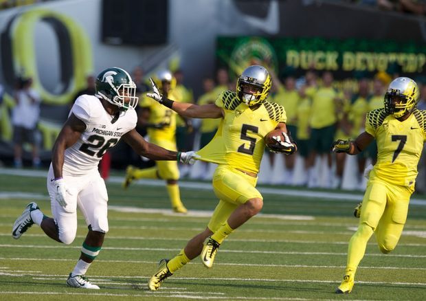
Oregon Ducks: 97 (NIKE)
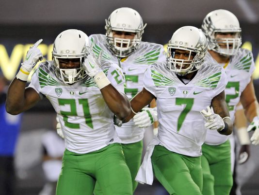
I know there are occasionally uniforms that Oregon might put together that are a little much for some people. I also know that this is the highest grade I’ve given so far. I just know that there is no more identifiable brand in all of college football. The “O” logo is perfect because it doesn’t overwhelm the helmet and allows the design team to create any number of combinations. There have been so many in recent years it will be difficult to pick the best one so I’ll just put up a few and you can all bask in the glory of the Oregon wardrobe. The Ducks typically redesign their template every few years and are always on the cutting edge of uniform technology.


Washington Huskies: 83 (NIKE)

I like the colors and I the design has a certain appeal to it. The team has rebounded after a tough stretch and they look good doing it. The numbers have a little quirky coloring and I might simply remove those odd looks.
California Golden Bears: 78 (NIKE)
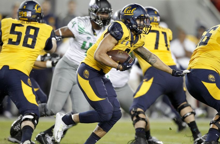
One of the most difficult to score happened to be the Cal Golden Bears. The black trim and subtle roaring bear design on the shoulders is cool. The design is, however, almost impossible to see unless you are looking for it on the navy jersey. The jagged stripes on the pants are a lot to handle. I feel like this design was close to what West Virginia has except it fell a little short.
Oregon State Beavers: 76 (NIKE)
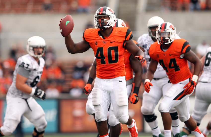
Oklahoma State’s color scheme with a splash of an inferiority complex (Oregon’s prowess casts a pretty big shadow). The helmet boasts a lot of added touches and is decent. I think the color combination is pretty good. The pant stripes are not my favorite, they are the capri pants of pant stripes. Are they pants or are they shorts?
Stanford Cardinal: 73 (NIKE)

The poor man’s Alabama Crimson Tide uniform. Stanford actually has a few cool helmets and they’ve had a couple alternates in years past. The overall look is just not there for me to give them any more points than this.
Washington State Cougars: 65 (NIKE)
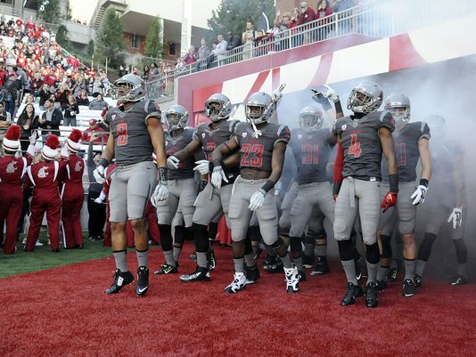
The Cougars actually do have grey in their primary color rotation so this isn’t a case of Nike going wild with grey again. The logo on the helmet has always been pretty cool (weaving the “WSC” letters to look like a cougar’s head). The downside is that the grey jersey is slightly darker than the pants, making the uniform look a little sloppy. I will say, however, that Nike loves grey so they are thrilled with Washington State’s look.
