I finally have a chance to split things back up so that’s the plan. I’ve got the Pac-12 South coming at you first. I will have the Pac-12 North coming up next. I know you all can’t wait to get to it and I assume you know the scoring system by now. Enjoy!
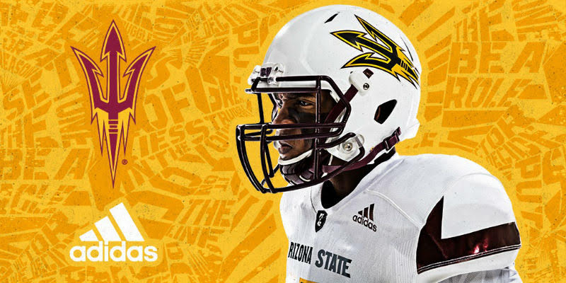
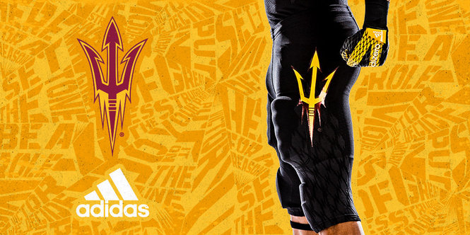
Arizona State Sun Devils: 93 (Adidas)

I actually liked the Nike redesign a few years back and now these are next level. The pitchfork on the pants is insanely good. I am usually not a fan of the all-black look and Arizona State’s all-black is making me rethink that. The all-white is also quite good and the rumor is there will be an alternate worn against Texas A&M in week one. The alternate appears to be a yellow helmet (not originally released) worn with the traditional home jersey and pants. (Forgive me on all of the photos, since the uniform has yet to be worn on the field I had to get different photos of each aspect.)
UCLA Bruins: 90 (Adidas)
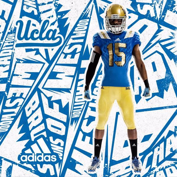

These colors are fantastic (despite being a little less masculine than some might like). The alternates have been pretty good (especially last season’s “L.A. Steel”). This year, UCLA will debut another alternate that will feature a lot of black and gold. The helmets are classic and the home uniforms are one of the best. These uniforms give UCLA the (unofficial) Official California State Uniform Championship over all other schools in the state. They got a slight template tweak this year and they will debut this black uniform combo at some point this season (likely near Halloween).
USC Trojans: 77 (NIKE)
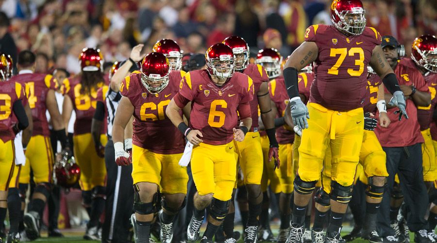
The Trojans have a classic look. I have never liked the helmet all that much and feel like the Trojan logo needs to be bigger. They could even use the script “USC.” The Trojans did shake things up a bit last year and gave these chrome lids a shot. The best look they have is their road uniform. The home uniforms look vaguely like Iowa State (much better, but there is little besides the two primary colors). I also never liked the move from white socks, undershirts, etc. to black. I feel like the team should go with red or yellow undershirts, socks, cleats, etc.
Arizona Wildcats: 69 (NIKE)

These uniforms were probably at their best around 2010. I don’t really understand why they are constantly tweaking their options. The all-red looks horrible on television. The colors are good, so why not just embrace them and mix and match versus going with monochrome looks. This copper helmet is unique to Arizona and I think they should be paired with something a little better than all-navy. The numbers and shoulders have a “setting sun” look to them.
Colorado Buffaloes: 67 (NIKE)
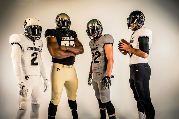
The redesign has helped immensely. The Buffs now boast a white, black, gold, and silver helmet. The uniform combinations range from all-white, all-black, all-grey (I’m not even making this up), and a more traditional black jersey with gold pants combo. I think all of the helmets are cool, especially the gold and white helmets. I probably prefer the classic combination (gold pants) over the others.
Utah Utes: 55 (Under Armour)
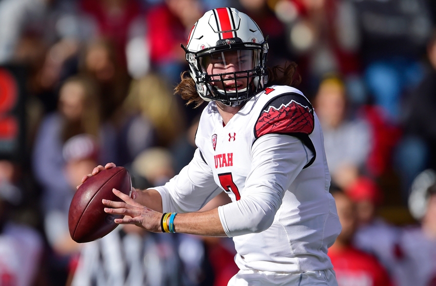
There are mountains on the shoulders. The black helmet is okay. The rest of them are hopelessly bland. There has to be a happy medium between really bland and bizarre, I just Utah finds it soon.
