In a conference with no divisions. I am going to stick to the script and review the entire conference at once. If you have been reading then you already know that the scores are built upon a few different things. The grading scale is as follows: school colors, helmet design, uniform design, cleat design, originality, and tradition (in essence, is the uniform unique to that particular school). The scores are assigned a numerical grade and are listed from highest to lowest below.
Texas Longhorns: 94 (NIKE)
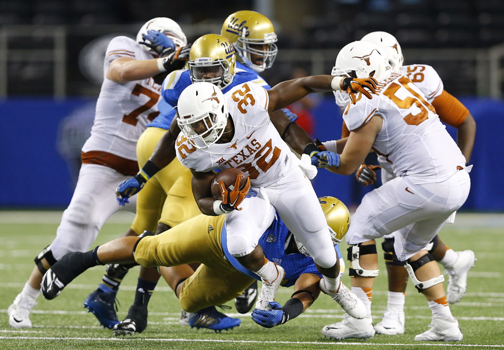
I have to admit that I think this might be the best uniform in college football in terms of brand recognition. The helmet looks better without the number decals. The longhorn logo is basically the logo for the whole state. I know that Texas has been on the decline since 2009 but with uniforms like these the future has to be somewhat bright. I actually don’t mind the shiny helmet decals and the burnt orange looks great. A question that needs to be answered, is this the best all-white look in all of college football?
Oklahoma State Cowboys: 87 (NIKE)
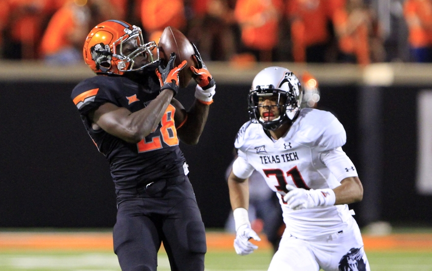
There are times when the Cowboys wear uniforms that make me think of Halloween. There are, however, so many nice combinations in this set. I don’t love the “OSU” helmets and I think these new chrome (see Rutgers) helmets are pretty cool. The Pistol Pete logo is awesome. The combinations are vast with orange, black, white, and grey (Nike loves grey) helmets, pants, and jerseys.
West Virginia Mountaineers: 85 (NIKE)
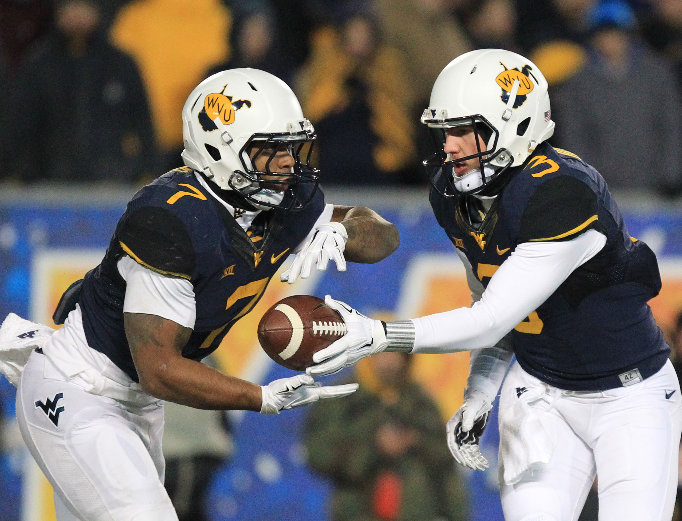
The throwback helmets are crazy good. The logo is awesome and the school colors are pretty solid. I like that they have incorporate more yellow into the uniform in the last few years. I do not, however, like the black trim on the blue jerseys. I think these are good with great potential with a few minor adjustments.
Oklahoma Sooners: 79 (NIKE)

I used to love these. The logo is cool and I think their colors are pretty good. The alternates, however, are not good at all. The collar contrast is huge and looks out of place.
Baylor Bears: 77 (NIKE)
![baylor-nike-football-uniform-620x578[1]](https://4downterritory.com/wp-content/uploads/2015/08/baylor-nike-football-uniform-620x5781.jpg)
A lot of people talk about a team’s uniforms losing their own identity and assuming the identity of the brand. Baylor is officially Nike of Waco, TX. The classic uniforms look great and occasionally the alternates look pretty good. I just don’t see enough of green, gold, and white. Oh wait, there is ANOTHER GREY ALTERNATE.
Kansas State Wildcats: 75 (NIKE)

Kansas State has a nice color scheme that is reasonably unique (purple and silver). The Wildcats have stuck with what works for them. The purple pants experiments have not gone well so hopefully they’ll keep it consistent this year.
TCU Horned Frogs: 70 NIKE)
![New-TCU-Football-Uniforms-Alternate-1[1]](https://4downterritory.com/wp-content/uploads/2015/08/new-tcu-football-uniforms-alternate-11.jpg)
These are incredibly original. The Frogs got a redesign this season and the reviews are mixed. They have the best number font in all of college football. They have Trevone Boykin, who is an absolute baller, and my pick for the Heisman trophy. They have scales on their uniforms, so there is that. I’m tempted to say that I like the all-white the best because you either can’t see scale pattern or maybe it’s just not there. Oh wait, there is ANOTHER GREY ALTERNATE.

Kansas Jayhawks: 65 (Adidas)
![ncaa-football-kansas-baylor-850x560[1]](https://4downterritory.com/wp-content/uploads/2015/08/ncaa-football-kansas-baylor-850x5601.jpg)
The number font is odd and the numbers might be chrome this year. I don’t think the color scheme is actually one of my favorites and I have always loved the basketball uniforms. The football uniforms leave little to be desired. The helmet decal with the Jayhawk looks a little like a cartoon character.
Texas Tech Red Raiders: 58 (Under Armour)
![Screen-Shot-2014-09-08-at-3.57.59-PM[1]](https://4downterritory.com/wp-content/uploads/2015/08/screen-shot-2014-09-08-at-3-57-59-pm1.png)
The throwbacks were amazing. I feel like I should congratulate Under Armour and send them a box of chocolates. The rest of the uniforms (and there are at least a million combinations) are just all over the place.
Iowa State Cyclones: 47 (NIKE)
![4cd6233a7e1bf.image_[1]](https://4downterritory.com/wp-content/uploads/2015/08/4cd6233a7e1bf-image_1.jpg)
Sam Pouncey has always compared their colors to ketchup and mustard. If that is the case, these are not the name brand ketchup and mustard options. There is a rumor of a an all-gold uniform for this year. I would recommend, if that comes to fruition, to look away.
