I hope you are enjoying reading the first annual CFSG as much as I am enjoying writing it. I thought I would shake things up this week and include all of the teams in one article instead of breaking it down by division. I felt the need to do this mostly because the Big Ten is perhaps one of the weakest uniform conferences (read: the weakest) in college football. The grading scale is as follows: school colors, helmet design, uniform design, cleat design, originality, and tradition (in essence, is the uniform unique to that particular school). The scores are assigned a numerical grade and are listed from highest to lowest below. At its best, it’s subjective and at its worst, well, it’s subjective.
The Good: How About These Uniforms!
Michigan State Spartans: 89 (NIKE)
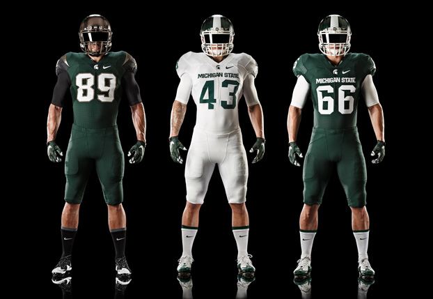
After years of having a great color scheme and bizarre stripes, I think the redesign looks great. The alternate uniform will be cool too. I cant’ give them as many points as I would like due to the numerous changes to the uniform in the last few years. This look could be excellent and I am hoping they’ll leave these alone.
Ohio State Buckeyes: 86 (NIKE)
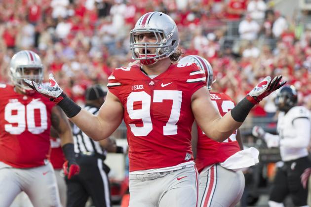
The helmets are classic and there are major points for tradition. The alternate helmets are used enough to shake things up. I love the home look and the colors contrast well. The road uniform looks a little washed out on television because of how light the pants are in comparison with the jersey. Also, the helmet stickers are a plus. The pants have shifted from silver to grey in recent years.
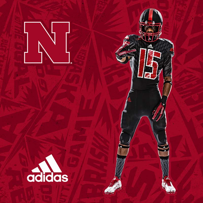
Nebraska Cornhuskers: 83 (Adidas)
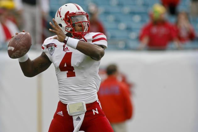
The new alternate looks pretty good for an all-black uniform. The Huskers have a history of experimenting with the color and I think the pants on these look pretty good. The helmet is so classic it’s crazy. The block “N” is Nebraska football. The template is almost identical to Wisconsin but the Huskers are ranked ahead of them because they’ve had more success with alternate looks.
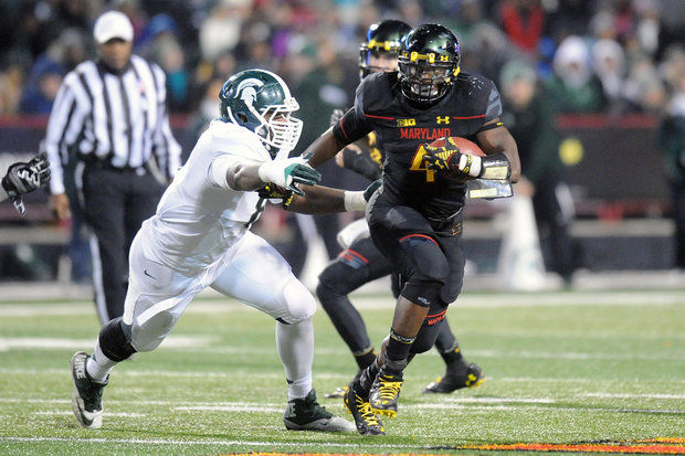
Maryland Terrapins: 80 (Under Armour)
I applaud the Terrapins willingness to be bold. They are Under Armour’s flagship school and the Maryland state flag is incorporated into their uniform. There are definitely some looks that are not great (as is the case with all teams with hundreds of uniform combinations) but I generally like what they wear. They are always decked out in the latest UA gear and I have to commend them on building their brand.
Illinois Fighting Illini: 80 (NIKE)

One of the rare Nike grey alternate’s that I really like. These are sweet and there is nothing wrong with their usual jerseys either. I-L-L (pause) I-N-I.
The Pretty Good: We Have Some Solid Threads!
Iowa Hawkeyes: 77 (NIKE)

A cool logo and a striking color combination. The uniforms almost have a Pittsburgh Steelers vibe. I love the road look but if only there were a pair of black pants. These uniforms are not for everyone and lack the appeal of the uniforms in the top category.
Michigan Wolverines: 75(*Adidas)
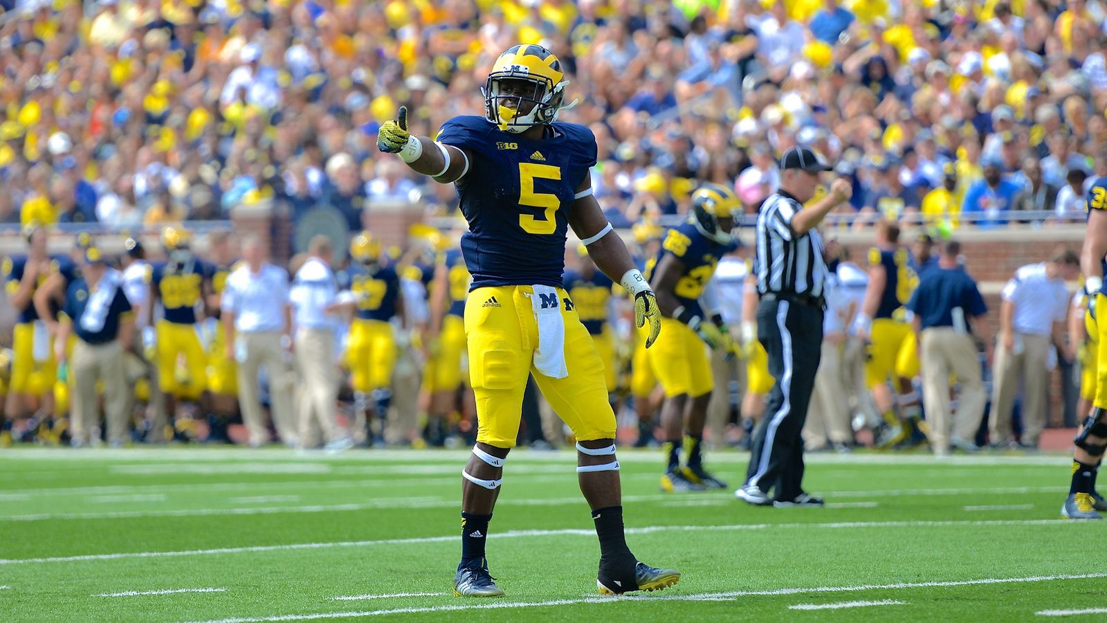
I put an * next to Michigan because they’ll be switching to Nike soon. The Adidas run with the Wolverines has had its ups and downs. I never liked the tweaks that were made during the Rich Rod-era. The helmets are a staple and I think Nike will try to get back to basics on this uniform (plus a grey alternate because that’s what Nike does in 2015). Adidas likely gets out at a good time considering Michigan’s athletic programs have been on the decline for about a decade.
Wisconsin Badgers: 74 (Adidas)
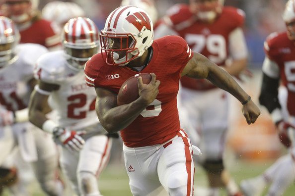
Wisconsin is in an unusual situation. They have almost the identical template to Nebraska and similar colors. They do not, however, have the same rating for a few reasons. First, the facemask and logo on the helmet are slightly different shades of red. In fact, the helmet (even the red helmet) is a different hue than the red jersey. They are basically like Nebraska’s little brother who got the faded clothes from the previous school year.
Minnesota Golden Gophers: 74 (NIKE)
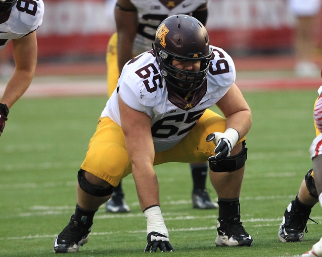
(Photo Courtesy of Pat Lovell/USA TODAY Sports)
The maroon is a little darker, almost a brown hue, than most. I do like the yellow and the uniforms look much better than they used to.
The Average: We’ve Got Uniforms!
Penn State Nittany Lions: 66 (NIKE)
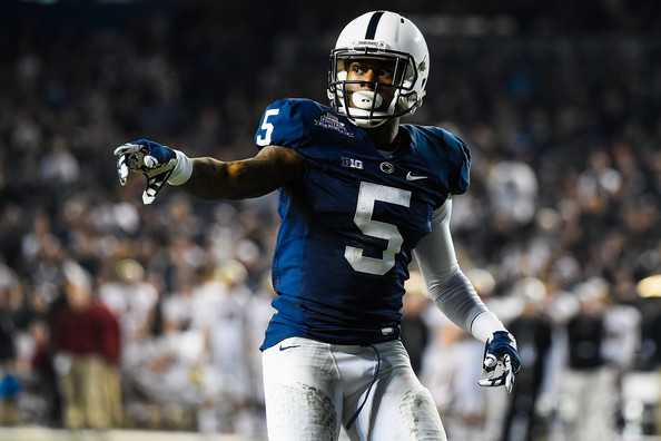
Vanilla ice cream is a popular flavor. These are the vanilla ice cream of college football uniforms. I applaud the Penn State brand for keeping things consistent but seriously? These helmets wouldn’t be considered flashy for a youth football team at the local Y.M.C.A. There are always rumors that there will be adjustments but nothing ever comes to fruition.
Indiana Hoosiers: 65 (Adidas)
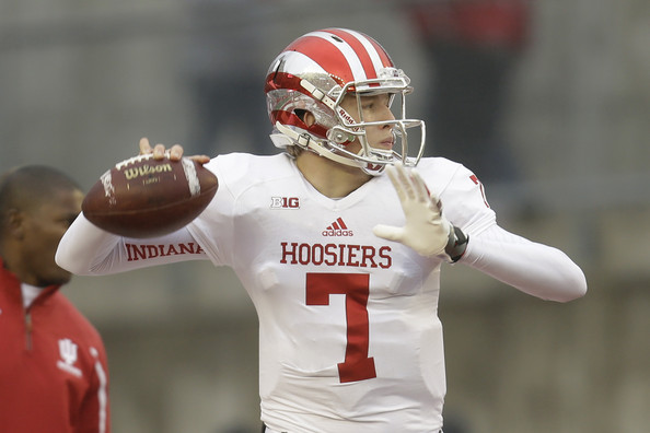
I don’t hate these. The helmets are actually pretty cool and the uniform set looks pretty sharp. There is little to be impressed with outside of the helmets. If I was summarize these into one word, that word would be pedestrian.
The Ugly: What Are These?
Rutgers Scarlet Knights: 58 (NIKE)
Rutgers: “How much chrome can we incorporate into our uniform?”
Nike: “Umm… Not really sure, we can try out a few things that will incorporate it a little more.”
Rutgers: “Great, now blast all of our uniforms with chrome.”
I’m anxiously awaiting a day where Rutgers comes out in a monochrome chrome uniform.
Northwestern Wildcats: 55 (Under Armour)
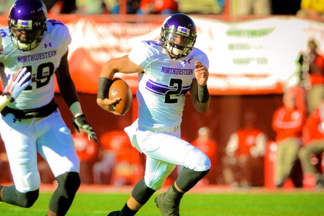
The stripes across the chest are one of the boldest moves Northwestern has made its football history. I don’t think there is much else to say on the matter.
Purdue Boilermakers: 45 (NIKE)
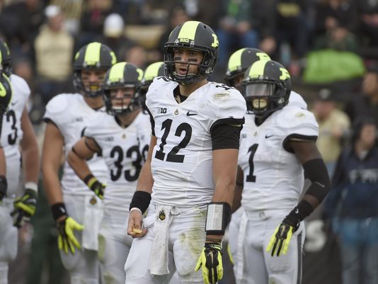
Make it stop. I know there are millions of people out there who believe that Nike can do no wrong. Those people need to look at these.
