The College Football Style Guide was born out of a desire to showcase and analyze the best looks in all of college football. I know that my rankings will not necessarily be the same as some others and, for the most part, these types of things are highly subjective. In order to appreciate the rankings, teams will be judged based upon the following categories: school colors, helmet design, uniform design, cleat design, originality, and tradition (in essence, is the uniform unique to that particular school). The scores are assigned a numerical grade and are listed from highest to lowest below. The images used will showcase each team’s best look.
Florida State Seminoles: 94 (NIKE)
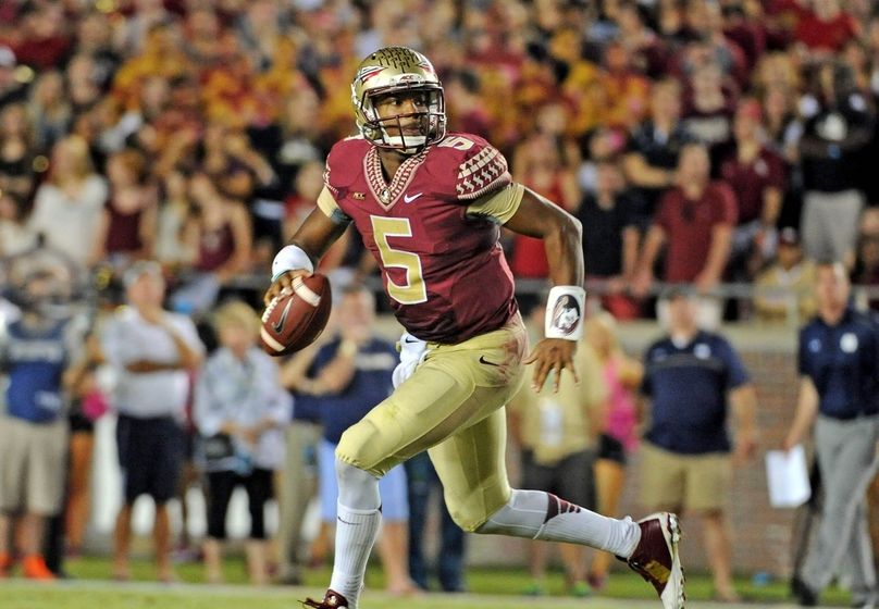
Florida State has one of the best looks in the country. The garnet and gold color scheme looks sharp and the pants don’t have a high-sheen finish. I think the helmet is so original and is totally unique to Florida State. The piping around the collar and shoulders is a nice touch. The team has two alternate options and has experimented over the years with different looks. The helmets actually were a little more yellow and they used the gold numbers on their white jerseys early in 2014. They quickly adjusted due to the problems with the numbers showing up from a distance and on television. The look is identifiable and offers a slight twist on a very traditional look.
Clemson Tigers: 92 (NIKE)
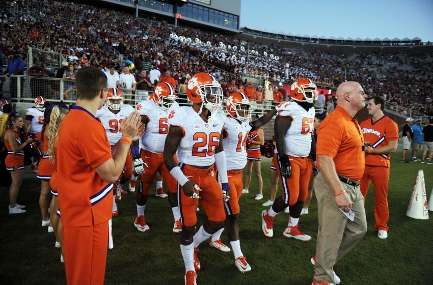
The Clemson Tigers color scheme is one of the most unique (?) in all of college football. While I would not have put orange and purple together, the colors really do complement each other well. The Tigers have thankfully ended their love affair with the purple uniforms and have played it smart with the orange and white options. The road uniforms are one of my favorite looks and I love the helmets. The Tigers probably wear the all-orange uniform combination a little too much for my taste. I think that the color scheme is unique and when fans think about a the paw on the helmet, Clemson is the first team that comes to mind.
Louisville Cardinals: 87 (Adidas)
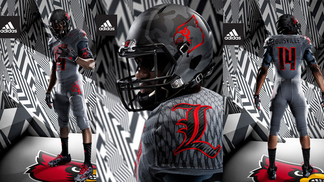
Louisville has definitely had some bold looks the last few years and I have generally liked them. I think the white helmets are a little lackluster due to the logo. In this particular uniform, however, the cardinal logo looks menacing. The color scheme is strong and the team avoids wearing too much black. I definitely think Adidas has come a long way with the Louisville uniform designs in the last few years. I would encourage all of you to look up their uniform for the their upcoming game against the Auburn Tigers.
Syracuse Orange: 67 (NIKE)
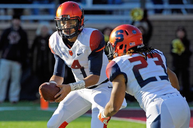
Syracuse showcased some new threads in 2014 and the results were mixed. I personally applaud their efforts to be bold. The number font and fading colors is very modern. The helmet design is surprisingly vanilla considering all of the the intricacies these uniforms have. I can’t stand the all-grey alternates, which was Nike’s favorite redesign option for teams in 2014. I think the uniforms are original enough to not be graded too poorly and I think they are fairly average (despite their flamboyance).
NC State Wolfpack: 63 (Adidas)
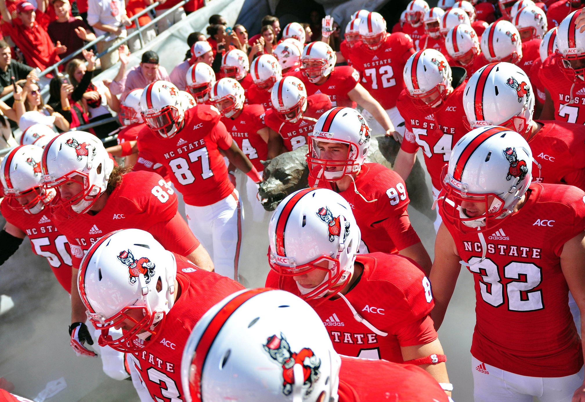
NC State’s uniform just has too much red and not enough contrast to be considered a good uniform. The helmets featuring the traditional NC State logo look like a giant “S.” I do, however, love these helmets. They feature the throwback logo and these should be worn as much as possible. The monochrome red option is worn way too often and there is probably a redesign in their near future. Adidas could have definitely done more with these and the only thing unique about NC State is their team’s nickname.
Wake Forest Demon Deacons: 56 (Nike)
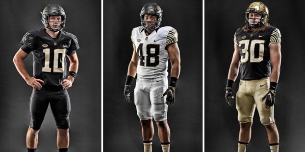
Wake Forest definitely has the most unique nickname in all of college football. The Demon Deacons’ uniforms were very recently redesigned by Nike and the results are an upgrade over the last few years. The logo on the helmet is not very sleek and looks a little clunky. I do think the matte-finish on the black helmet will look good. These uniforms are basically what Vanderbilt would have if their logo wasn’t quite as good. I probably like the black jerseys with gold pants the most. I look forward to seeing what they look like on the field and on television.
Boston College Eagles: 55 (Under Armour)

For those of you who are familiar with the NCAA Football by EA Sports franchise, these look like the uniforms you had to wear in high school before choosing your college. They are just so bland. The gold is dull and gets faded out during the year. The helmet design is probably the worst part. I think about how awesome Notre Dame’s helmets are and then, if you multiply the awesomeness by zero, you get Boston College’s helmets.
